こんにちは!本記事では、Flutterでよく使うウィジェットAppBar()について変更できる変数や戻るボタンなどのアクションボタンの設置方法について、チートシートをベースに説明していきます。
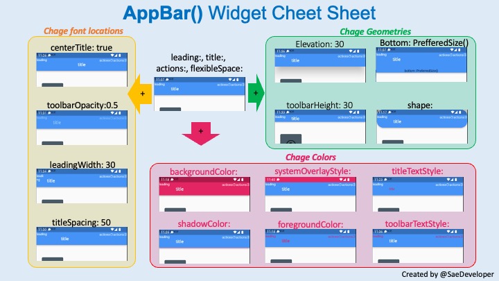
AppBar()カスタマイズ用チートシート
コードを書く際にすぐわかるように、各変数をいじってチートシートを作成しました。こちらをベースに説明していきます。
AppBarとは?
そもそもAppBarとは、画面上に常に表示されるツールバーのことです。表示している画面の内容や、元の画面に戻る、アクションなどを実装します。
AppBarの実装方法
AppBarは、Scaffold()ウィジェットの中で宣言することが可能です。以下のように記述します。
@override
Widget build(BuildContext context){
return Scaffold(
appBar: AppBar(
title: Text("title"),
),
);
}
以下で説明する内容は、AppBar()の()内で設定できるパラメータ(上記だとtitle: にあたる箇所)についてです。以下のデザインを使用したい場合は、()内で宣言するようにしてください。
基本のデザイン
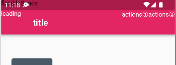
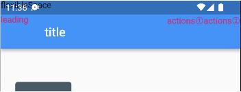
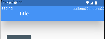
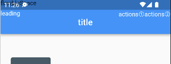
基本のデザインを全てText(“変数名”)で記入し実行したものが下の写真になります。
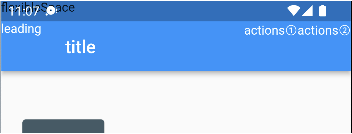
コードはこんな感じ。
          appBar: AppBar(
            leading: Text("leading"),
            title: Text("title"),
            actions: [Text("actions①"), Text("actions②")],
          ),
leading:
ツールバー左上、ステータスバーに被らないところに表示されます。
title:
AppBarの真ん中らへんに表示される、メインの文字です。
actions:
右に表示されます。actions: []と、配列で設定します。ボタンなどを置くことができます。
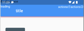
flexibleSpace:
ステータスバーにかぶるところです。ここにSizeBoxとかおけばステータスバーをうまくアレンジできそう。
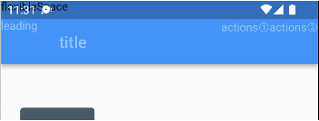
色の変更
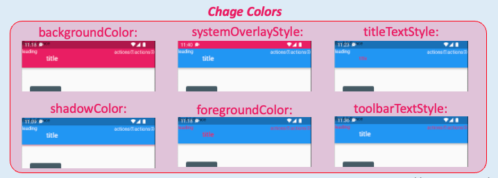
各エリアの色を変えることができます。今回はわかりやすいように全てピンクを指定してみました。
backgroundColor:
ステータスバーを含めた全ての箇所の背景色が変わります。
systemOverleyStyle:
ステータスバーの背景色が変わります。
titleTextStyle:
titleの文字色が変わります。
toolBarTextStyle:
title以外の文字色が変わります。
foregroundColor:
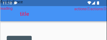
flexibleSpace以外の全ての文字色が変わります。
shadowColor:
AppBar下の影の色が変わります。
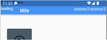
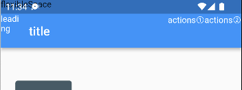
AppBarの寸法変更
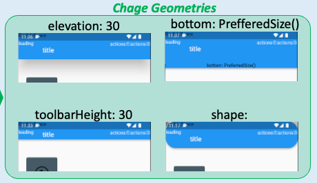
ツールバーの形状を変化させる変数です。
elevation:
AppBarの下の影の広さを調整できます。
bottom:
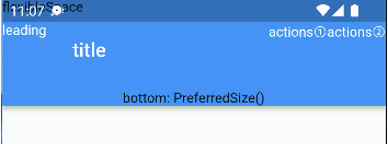
AppBarの下にbottomBarとでもいうのでしょうか、領域ができます。
toolbarHeight:
ツールバーの幅を調整できます。
shape:
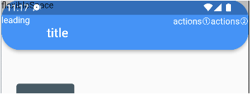
AppBarの形状を変更できます。上の図ではRoundedRectangleBorder(borderRadius: BorderRadius.circular(30))を使用しました。
フォント配置の変更
centerTitle: true
titleが中央に配置されます。
toolbarOpacity: 0.5
文字の透過率を変更できます。
leadingWidth:
leading部分の幅を変更できます。
titleSpacing:
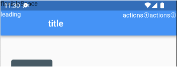
titleの前のスペースを変更できます。
関連記事
Flutterの記事をまとめています。

コメント